
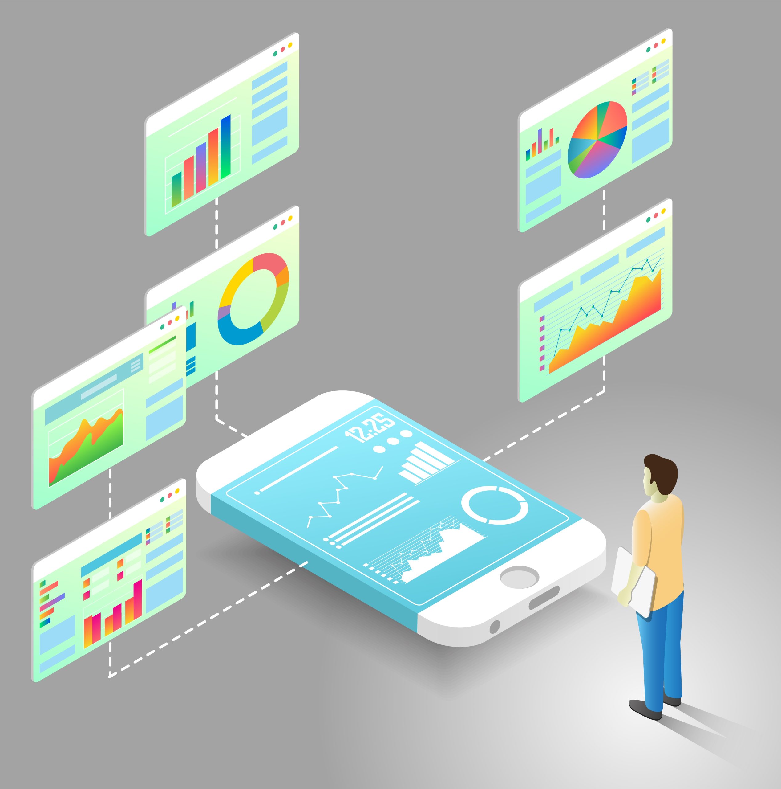
Introduction: Dashboards Are No Longer Desktop-Only
Dashboards used to live on large monitors in offices and control rooms. Today, they travel with us. Managers check KPIs on their phones. Supervisors glance at alerts on tablets. Executives review performance while moving between meetings. This shift has changed how dashboards must be designed. Mobile-first dashboard UX is no longer a design trend. It is a practical response to how people actually consume data. When teams design for mobile first, they naturally focus on clarity, relevance, and speed. Those qualities improve the experience on every screen size.
What Mobile-First Really Means for Dashboard UX
Mobile-first design does not mean building a “lite” version of a dashboard. It means starting with the most constrained environment and making intentional choices. On a phone, users want fast answers, not deep exploration. They ask simple questions such as “Are we on track?” or “Is something wrong right now?” Mobile-first UX forces teams to identify what truly matters. By doing this early, designers avoid clutter and build dashboards that feel purposeful rather than crowded.
Getting Information Hierarchy Right on Small Screens
Small screens leave no room for indecision. Every metric must earn its place. Strong information hierarchy helps users understand what matters without thinking too hard. Key metrics should appear first. Supporting details should follow naturally. Less important data can stay hidden until needed. When hierarchy is clear, users scan dashboards quickly and confidently. When it is not, users hesitate, scroll endlessly, and lose trust in the dashboard altogether.
Designing for Fingers, Not Cursors
Mobile dashboards live in a touch-first world. Fingers are far less precise than mouse pointers. Buttons that feel fine on desktop often become frustrating on mobile. Mobile-first UX prioritizes large touch targets, generous spacing, and simple interactions. Designers must avoid hover-based actions that do not work on touch screens. When dashboards respect the realities of touch, they feel natural instead of awkward.
Responsive Layouts Should Adapt, Not Just Resize
Responsive design often gets misunderstood. Shrinking a desktop dashboard to fit a phone rarely works. Good responsive dashboards adapt their layout based on screen size. Charts stack vertically on mobile. Tables transform into cards or summaries. Filters move to secondary screens. These adjustments preserve readability and meaning. Dashboards that adapt thoughtfully feel designed for the device instead of squeezed into it.
Keeping Visualizations Simple and Readable
What works on a large screen can fail on a small one. Dense tables and complex charts do not translate well to mobile. Mobile-first dashboards favor simple visuals that communicate trends at a glance. Clear labels, strong contrast, and minimal decoration make a big difference. The goal is not to show everything. The goal is to show the right thing clearly. Deeper analysis can always live behind drill-downs.
Performance Matters More Than Ever on Mobile
Mobile users often deal with slower networks and limited bandwidth. If a dashboard loads slowly, users abandon it. Mobile-first UX treats performance as a design requirement, not a technical afterthought. Lightweight visuals and progressive loading help users see critical metrics quickly. When dashboards respond fast, users trust them more. Performance is part of the user experience, even if users never say it out loud.
Designing for Real-World Context
People use mobile dashboards in real situations, not ideal ones. They may stand on a factory floor, walk between meetings, or glance at data during a call. Mobile-first UX accounts for these contexts. Dashboards should surface alerts, thresholds, and summaries that support quick decisions. Long explanations and dense analysis belong elsewhere. Context-aware design respects how and when users engage with data.
Staying Consistent Across Devices
While mobile-first design leads the process, consistency still matters. Users expect dashboards to feel familiar whether they open them on a phone or a laptop. Navigation, terminology, and visual language should remain consistent. At the same time, each device deserves its own layout decisions. The best dashboards balance familiarity with flexibility. They feel like the same product everywhere, without forcing identical designs.
Accessibility Is Not Optional
Mobile-first design highlights accessibility issues quickly. Small screens make poor contrast, tiny text, and clutter more obvious. Designers must think about readability in different lighting conditions. Touch interactions must work for users with limited dexterity. Screen reader support and semantic structure remain important. Accessible dashboards help everyone, not just users with specific needs.
Common Mistakes Teams Still Make
Many teams still design dashboards for desktop first and “fix” mobile later. This approach usually leads to frustration. Another mistake is oversimplifying mobile dashboards until they lose meaning. Mobile-first UX requires thoughtful prioritization, not aggressive reduction. Teams that test dashboards on real devices early gain better insights than those relying only on design tools.
Conclusion: Design Dashboards for How People Live and Work
Mobile-first dashboard UX reflects a simple truth. People want insights wherever they are, on whatever device they have. Designing with mobile in mind leads to clearer thinking, better performance, and stronger adoption. Responsive design ensures those benefits scale across screens. The best dashboards do not impress with complexity. They succeed because they respect the user’s time, context, and attention.